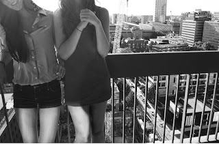
Friday, November 12, 2010

Assignment 4 Critique Part 2

Image 1:

Interpretation: Others thought that this could be a moosejaw add succesfully, they thought the viewers eyes were intense because of the contrast, just as I wanted.

Evaluation: They didn't really have anything to change, but I wonder still if the white snow in the background is distracting or not.  Also, more of the clothing could be shown.

Extension: I would like to create more sports adds.  I really liked setting this shot up and the lighting was perfect at the time.


Image 2:

Interpretation: The class liked this image but they found the neck to be distracting and the image to have more of a creepy feel than an advertisement which I agree with.  

Evaluation: The hands are a little too bright and there is too much jewelry so it is tough to know what to focus on which distracts from the original intent.

Extension: I could do more images with jewelry although I did not particularly enjoy taking this image.  I found it difficult to know what an add for jewelry should look like and how much of the subject to have in the image.


Image 3:

Interpretation: The class liked this image, and they said that the foam took on its own form though it did not really look like foam or an advertisement.

Evaluation: They said everything about it was interesting, but that it did not look like an add which I agree with.  They suggested it be in color or maybe a smaller explosion to show more of the bottle.

Extension: I could do this in a bathtub or something else with a background not as distracting so then the form that the explosion would take would be entirely real.


Image 4:

Interpretation: Others liked this image, especially the lighting, but they were unsure of what to focus on in the image.  They thought the shapes created and the contrast was interesting.

Evaluation: I could have darkened the shirt and scarf and face and kept the hat, legs and shoes light which would have showed a really cool shape. 

Extension: More fashion photography and more experimentation with light and how light is able to make something better or worse in some cases.

Assignment 4 Critique

Image 1

Cropping: I tried several crops for this photo.  I wanted the image to be mostly focused on the subject's eyes and intensity.  I tried cropping it smaller and leaving it bigger and this was the final result.  I like how much of the background you see in comparison to the foreground and I think the cropping was successful.

Background Elements: I chose to include some of the background.  I feel that this was necessary because I wanted the image to be about the person and their surroundings in order to get a better feel for the picture.  I darkened the background and I like the effect because it brings the subject closer and the background further away.

Sharpness/blur:  The subject is in focus whereas the background is a bit blurry.  I like the aperture I chose because you can still make out where the subject is and that the background is of trees, but the subject is focused so your eye is drawn to her.

Aboutness/motivation/methods:  I wanted to recreate some sort of a sports add (moosejaw in particular) so I wanted to advertise the water bottle, but mostly I just wanted to give a feeling of motivation so if this particular add were put in a store people would feel that they could look like that.  I shot it in afternoon light and I like how the lighting hits the figure

Context:  This image is mostly focused on advertising to get the buyer to want to be like the subject.


Image 2:

Lighting: Lighting is a very important aspect of this picture.  There was a lamp placed right in front of the subjects hands which is why they are illuminated so much.  The lighting is meant to make the eyes focus on the hands and in particular on the jewelry.

Contrast: The contrast in this image is very high and although I tend to make all of my images high contrast, I think this photo needed it.  There was a bit in the background that was distracting and increasing the contrast took the background out and illuminated the hands further.

Amount of subject to show in frame:  I chose to only include the portion I did in order to get a good feel for the jewelry and for the main emphasis, which is the hands.  I am not sure if I really like the bit of the neck I included, or if I hate it, but without it the image looked incomplete and not enough about the jewelry.

Aboutness/motivation/methods:  Originally, this image was supposed to be an advertisement for jewelry. I think I included way too much jewelry and because of it, the viewer focuses on the hands and not on the large amount of jewelry.  Also, the lighting is not what one would typically see on an advertisement and the face would probably have been shown.

Context: This image was meant to advertise, but I think the image has too much happening to call it an advertisement.


Image 3:

Background elements:  Although in the image, you can't see the background elements anymore, they were VERY distracting.  I chose to take this image outside with trees behind.  I did not realize the coke would explode so quickly and I did not know what to expect which is why I did it outside.  Also, in the foam are particles of grass that I tried to erase but instead I think the foam took on a life of its own whether that is good or bad.

Orientation: I chose to take this image portrait because if it had been landscape, it would take away from the exaggeration of the explosion.  I really like the form that the coke took on top, and I am still deciding if I like the bottom.

Placement of subject in frame:  I chose to crop the image so that the coke bottle was a little off center.  I did this because I wanted the foam to look more lifelike, and I think it somewhat worked, but the foam does not look real so I do not know how I feel about how it turned out.  I am happy with the cropping however.

Aboutness/motivation/methods:  Everything happened so fast, I really only got one shot of the explosion.  I used a high shutter speed but not too high because then the image would have turned out too dark.  I used just the lighting from the sun.  

Context:  The prompt for this image was poster, but I do not know if I can really see it being on a poster or not.  However, it does have an interesting shape and overall is interesting.

Image 4:

Cropping: Originally, there was a lot more in this image.  However, I found it very distracting and so I decided to crop out a lot of the background and also the back arm because I wanted the focus mostly to be on the leg and the shoe.  I think the cropping is effective but that I could have done something differently to make the viewer focus more on the shoe.

Lighting: For this image, I used just one lamp placed by the subject's feet.  This illuminated the pant leg and not the shoe, but I do like the effect.  I think the lighting on the shirt is nice as well, but maybe a little distracting if trying to focus on just the shoe.

Contrast:  I chose high contrast for this photo in order to emphasize the creases in the shirt and pants, and also the shadow created by the shoe.  I chose to black out the background and I think this was a good choice because the background was distracting.  The high contrast makes the light look more intense.

Aboutness/motivation/method: I used just one lamp by the subject's foot.  I wanted this to be an advertisement for the shoe but I think the lighting on the subject and hat is a little distracting, but I like the lighting so I chose not to darken it. 

Context: Meant to be an advertisement, and the viewer is meant to want to be the girl in the shoes. 

Thursday, November 11, 2010

Artists for Assignment 5

http://www.robertdoisneau.com/robert_doisneau_hotelkiss.htm

http://www.thomasdemand.de/


Thomas Demand (German) is a very interesting photographer.  At first glance you think that he is just taking a picture of a room, but it turns out he actually constructs the set and then takes images.  Usually the images have a cultural or political meaning. He aims at identifying the difference between what is true and what is constructed.  It is nearly impossible to tell the difference between the two in his photos.  He starts off by using a photo, then recreates it out of cardboard, then takes the images. The models he makes are life sized.

Robert Doisneau was a french photographer who took pictures mainly during world war 2.  His photographs are very interesting and he caught very candid-seeming great moments.  It was probably difficult using the camera available at the time period.  I really like the image of the fallen horse and the cyclo cross.  A lot of his images are of daily life, and Doisneau as a photographer was very interested in the simple marvels of daily life.  He is renouned for his image Kiss by the hotel de ville.

Monday, November 8, 2010

Blog #22

A. Series: Brainstorm various ways to make a “series” of photographic images. 

I really like series of images.  Ways to do this would be to: use the same lighting, use the same person, use a similar subject, or use the same theme.
B. Final Project: Your final project in this class will be designed by you. If you could tackle any photography project, what would it be? You could combine other media with photography (video, sculpture, drawing) or you could take one of your earlier assignments and expand it to create a larger project. If you are expanding an earlier project or creating an entirely new series of images, shoot for a series of at least 5 images. Describe an idea you have for your final project.

I would LOVE to do a photoshoot with blacklight.  I really want to spray paint or paint a model using neon colors and then use the black light to illuminate the subject.  I really have no idea how to do this and how to make the colors work but I really want to try.  It would be all different angles of the body or the face.  So everything would be using the same subject (they might even be holding things or using things) and different angles of this subject. 

Thursday, October 28, 2010

Assignment 3 Critique Part 2

Image 1:

Interpretation:  The class really liked this picture in showing the background over the people by choosing to not show the faces of the girls.

Evaluation: Everyone said that they liked the contrast but that there was too much lighting on the legs (which I did lighten) and it looked unnatural so I overdid it.

Extension:  I could use this image in showing more images with more faces missing in order to prove that faces do not show everything about a person: a lot of times it's more about body language.


Image 2:


Interpretation: The class liked this image as part of a series with all of my photographs.  They thought the angle was creative.

Evaluation: They said that I could have messed with the cropping or the contrast to emphasize different elements of the image.

Extension: I could use this image as a point of taking more images at interesting angles.  Angles that you usually do not look at images with.


Image 3:


Interpretation: The class thought this image showed a unique and very unusual angle compared to what someone would usually photograph.

Evaluation: They thought it did not really go with the series and I agree; the other three were much more cohesive and this image was kind of by itself.  They also said it had too much contrast which I definitely agree with.

Extension: I could take images of buildings from below like this and see how the distortion effects the image.


Image 4:


Interpretation: The class interpreted this image as the difference between a completed building and a building under construction; almost as though the reflection showed how the building under construction wanted to be like the other building or would eventually be like the other.

Evaluation: They liked this image as part of the series and thought that the building reflected was very clear and looked like it was duplicated in an unusual way.  

Extension: I like the idea of using reflections to show contradictions between the reflected image and the thing that the reflection is being reflected on. 

Blog Entry #20

Describe some common aesthetic aspects of “news”-related photographs.

  • News related photographs tend to be kind of overly dramatic, whether it be intentional or not, mostly because we like to look at things that are unusual or interesting, and not just every day images. 

Describe some common aesthetic aspects of “snapshots”. 
  •  Snapshots can only be taken once, whereas digital images can be taken several times.  Therefore, snapshots are usually very posed and unnatural.  Snapshots are rarely candid because you never know how they are going to turn out.
Describe some common aesthetic aspects of advertisement photographs. Fashion photography? Product photography?
  •  Advertisement photographs tend to have very intense lighting and everything in the image (or the part the photographer wants you to focus on) is very clear.  The lighting and sharpness has to be turned up so that the image can be projected largely and so that a person can easily see what is happening otherwise the product will not look appealing.  Fashion photography tends to be set against a solid background in order to illuminate the clothing and model.  The lighting is always very intense and direct to show detail in clothing.  The contrast is also usually high to show detail.
Describe some common aesthetic aspects of film or movie stills.
  •  Film still are very emotional usually because the film still need to be interesting.  Sometimes they are very picturesque. Usually though they are exciting and have a lot of motion. 
Describe some common aesthetic aspects of yearbook photos and/or senior pictures.

  • I never had a senior pictures but I have seen a ton.  They are VERY posed, VERY unnatural, and personally I think people look very silly in the pictures.  They really do not show much about the person.  They have a nice natural lighting in order to make skin, hair and clothing look very clean and perfect.  The poses are usually around nature and awkward, or in studios in weird poses. 

Assignment 3 Photo Critique

 Image 1:
Cropping: I chose to crop this image as it is because I wanted the image to be about the background instead of being about the two girls.  I think with cutting out the face (or most of it) my mission was achieved.  I left the smile though because I liked the happiness in the picture.  I wanted it to feel bright.


Background elements: The background is the most important part of this image.  I chose to sharpen the background so that the focus was really on the background with the girls being the second most important thing. I also chose a high contrast for the background to illuminate the whites on the building and I whitened the back of the buildings to look like the background goes on forever.


Amount of subject to show in frame: The original shot had more of the legs and almost all of the face but I chose to crop it to reemphasize the background elements.  I also wanted to show more detail in the clothing. 


Aboutness/methods/motivation: For this picture I was really trying to show how an image can not be about people even if people are in the foreground.  I think this was effective because I cropped the faces off.  This picture was candid and shot in the day light.  


Context: I was hoping to show the humans place in landscape photography.


Image 2: 

Framing: I decided to crop out a larger part of the set and a large portion of the sky because I felt the buildings were more interesting than the bleached out sky.  I also chose to use an interesting angle in order to move away from the unoriginal picture of a landscape.  

Contrast: For this photo I tried to keep a medium contrast because when the contrast was too high it looks as if all the buildings were the same and all the sky was the same.  It was impossible to get more detail in the sky so I lowered the contrast.  I also dodged and burned certain areas in order to get more contrast because I did not want the image to look too gray.  

Lighting: The lighting is a very important part of this image.  I whited out the background to give the illusion that the buildings never end and for a smooth transition to the sky.  It was a morning light and it was very intense and I like how the light reflects off the buildings. 

Aboutness/methods/motivation: I wanted to show a different angle than the typical image of a landscape by taking the photograph at an angle.  I burned and dodged certain things to illuminate them.  

Context: This image is a normal landscape picture but I wanted to show the effect of morning light on a landscape. 


Image 3:
Visual design elements:  I really wanted to show an angel of a building that no one else would choose to photograph.  I am still not sure if the angle is interesting or awkward but I liked it and thought it was unusual.  The shapes created by the shadows and by the angle I took the photograph are interesting.  

Contrast:  There is a lot of contrast in this photograph, maybe even too much.  But I wanted to really show the shadows contradicting to the column and the building.  I wish there was more contrast on the column because it had an very unique texture on it.  

Orientation: The orientation of this image is portrait to show the whole column.  the image would be much different if I had taken it landscape.  It would have shown more of the building and would have created a much different overall feel.  

Aboutness/methods/motivation: I found and exciting building and took many pictures of it.  Interestingly, I took several images of it and thought this was was the most unusual.  

Context: I wanted to show an angle of this building that people see but would never choose to photograph.


Image 4:
Cropping:  I chose to crop out the top part of the building the image was reflecting into because I wanted to show more of the reflection and less of the white building.  I like how the cropping turned out and I like how it emphasizes the building and how the reflection almost makes the building look like it is duplicated.

Background elements:  The background elements inside the actual building are a bit distracting.  I tried to  burn and dodge parts of the building inside out but it was difficult because I still wanted to show that there it was a reflection.  Now that I look though, I do not find the elements too distracting but I would like to see how it would look with none.  

Focus:  The building is very in focus and the reflected image actually is not in focus but it appears to be.  I think this creates the duplication look and it is interesting and effective in showing the difference between the finished product and the product in process.

Aboutness/methods/motivation: I wanted to show the constructed building on the finished building to show the contradiction.  I took this image at an interesting angle.

Context: I wanted to show the contradiction between modernity and construction.