 | |||||||||||||||||||||||||||||||||||||||||||||||||||||||||||||||||||||||||||||||||||||||||||||||||||||||||||||||||||||||||
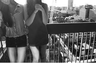
| Image 1: Cropping: I chose to crop this image as it is because I wanted the image to be about the background instead of being about the two girls. I think with cutting out the face (or most of it) my mission was achieved. I left the smile though because I liked the happiness in the picture. I wanted it to feel bright. Background elements: The background is the most important part of this image. I chose to sharpen the background so that the focus was really on the background with the girls being the second most important thing. I also chose a high contrast for the background to illuminate the whites on the building and I whitened the back of the buildings to look like the background goes on forever. Amount of subject to show in frame: The original shot had more of the legs and almost all of the face but I chose to crop it to reemphasize the background elements. I also wanted to show more detail in the clothing. Aboutness/methods/motivation: For this picture I was really trying to show how an image can not be about people even if people are in the foreground. I think this was effective because I cropped the faces off. This picture was candid and shot in the day light. Context: I was hoping to show the humans place in landscape photography. |
Framing: I decided to crop out a larger part of the set and a large portion of the sky because I felt the buildings were more interesting than the bleached out sky. I also chose to use an interesting angle in order to move away from the unoriginal picture of a landscape.
Contrast: For this photo I tried to keep a medium contrast because when the contrast was too high it looks as if all the buildings were the same and all the sky was the same. It was impossible to get more detail in the sky so I lowered the contrast. I also dodged and burned certain areas in order to get more contrast because I did not want the image to look too gray.
Lighting: The lighting is a very important part of this image. I whited out the background to give the illusion that the buildings never end and for a smooth transition to the sky. It was a morning light and it was very intense and I like how the light reflects off the buildings.
Aboutness/methods/motivation: I wanted to show a different angle than the typical image of a landscape by taking the photograph at an angle. I burned and dodged certain things to illuminate them.
Context: This image is a normal landscape picture but I wanted to show the effect of morning light on a landscape.
Image 3:
Visual design elements: I really wanted to show an angel of a building that no one else would choose to photograph. I am still not sure if the angle is interesting or awkward but I liked it and thought it was unusual. The shapes created by the shadows and by the angle I took the photograph are interesting.
Contrast: There is a lot of contrast in this photograph, maybe even too much. But I wanted to really show the shadows contradicting to the column and the building. I wish there was more contrast on the column because it had an very unique texture on it.
Orientation: The orientation of this image is portrait to show the whole column. the image would be much different if I had taken it landscape. It would have shown more of the building and would have created a much different overall feel.
Aboutness/methods/motivation: I found and exciting building and took many pictures of it. Interestingly, I took several images of it and thought this was was the most unusual.
Context: I wanted to show an angle of this building that people see but would never choose to photograph.
Image 4:
Cropping: I chose to crop out the top part of the building the image was reflecting into because I wanted to show more of the reflection and less of the white building. I like how the cropping turned out and I like how it emphasizes the building and how the reflection almost makes the building look like it is duplicated.
Background elements: The background elements inside the actual building are a bit distracting. I tried to burn and dodge parts of the building inside out but it was difficult because I still wanted to show that there it was a reflection. Now that I look though, I do not find the elements too distracting but I would like to see how it would look with none.
Focus: The building is very in focus and the reflected image actually is not in focus but it appears to be. I think this creates the duplication look and it is interesting and effective in showing the difference between the finished product and the product in process.
Aboutness/methods/motivation: I wanted to show the constructed building on the finished building to show the contradiction. I took this image at an interesting angle.
Context: I wanted to show the contradiction between modernity and construction.


No comments:
Post a Comment