Monday, December 13, 2010

Final Project Images Critique

Image 1:
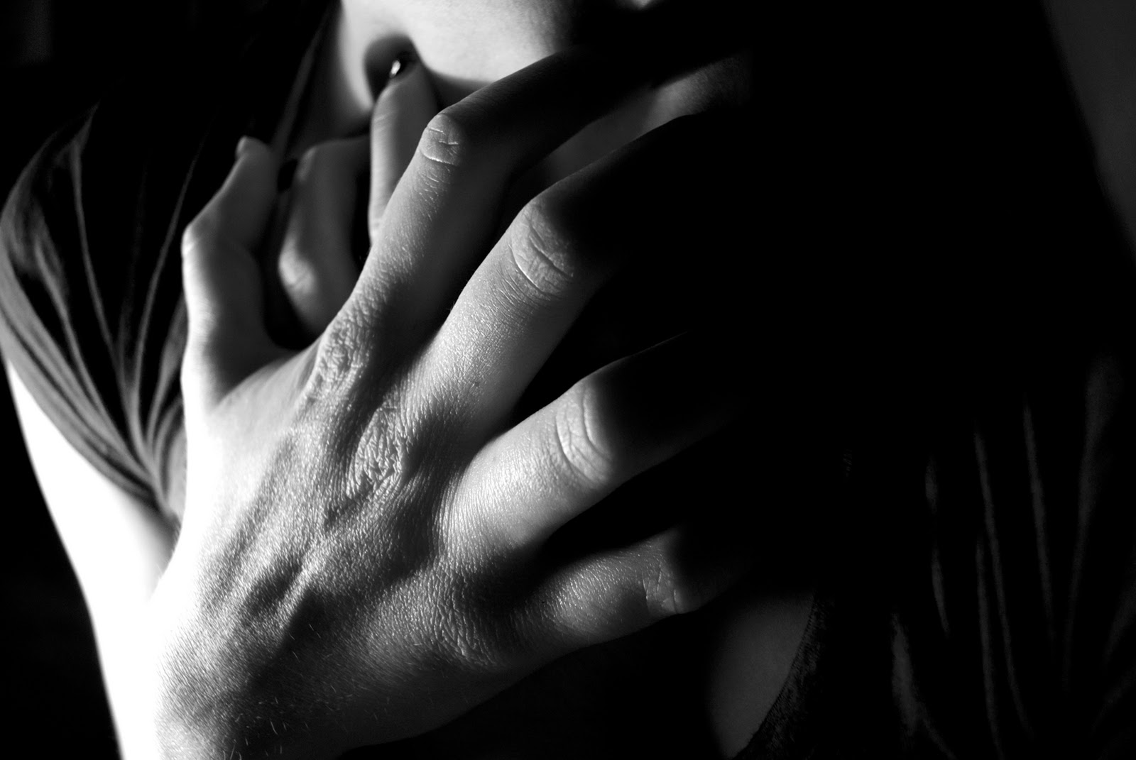
Amount of subject to show in frame:  For this image, I only chose to show a small portion of the face. I did this because I did not want the image to be about the face, but rather the hands on the face.  I like the composition of it and I think it really shows the emotion of despair, or at least sadness.

Background elements:  Although this seems minimal, there was a light in the background of the subject.  I chose to include the light because I wanted there to be a sort of "light at the end of the tunnel" so that although she is in a dark place, there is hope.  I hope it doesn't look distracting but I don't think it does.  I also blacked out a lot of the background.

Lighting:  Lighting is important in all of my images but in this image specifically it brings out the hands and the shadows created on the hands which furthermore show a dark emotion

Aboutness/motivation/context:  This image was meant to display despair.  I wanted the contrast and lighting to bring out the shadows.

Image 2:
Focus:  I took a lot of pictures of this position, and I almost chose a blurrier version.  In the end though, I am glad I chose this very detailed composition.  I think it is necessary because the image is a little hard to identify now, and if the legs are blurry, it's even harder to see.  Though having abstract photos is a cool idea, it's not necessarily what I am going for.

Contrast:  I really bumped up the contrast on this photo.  I also blackened (nearly completely, though if you look close you can see her shirt) the background.  The contrast makes a very nice effect on the hands and the arms almost look like they are from different people.

Framing: I really wanted this image to be about the arms and specifically the hands.  I was trying to show a sense of tension, like when you are waiting to do something and it is taking a long time.  The strain in the hands portrays this and I cropped out the top of the shirt because it was too distracting.

Aboutness/motivation/context:   This image was meant to be a tense moment experienced and how the hands were to interact with the body to express the emotion.  The hands are very wide and not bent which i think shows this well.

Image 3:
Cropping: Cropping is important in this image because there was more of her at first.  I chose to crop some off the bottom because again, I wanted the image to be about the hand and not about the girl's face.  I did want to show that it was a face, and I like the strange and unique angle of the way her head is tilted back.

Distracting elements:  I chose to keep in the light at the back of the image.  I don't know if everyone would find it distracting, but now that I am seeing it maybe it is.  I blacked out a lot of the background and I intentionally kept that light though now I don't know how I feel about it.

Orientation:  Orientation was important in this image, in particular because of the strange angle of the tilt of the head.  I think having the image portrait makes it more about the hand and it gives that feeling of struggling, almost choking.

Aboutness/motivation/context: This image was supposed to be about struggle.  You don't know whose hand this is whether it is the subjects or someone else's.  This gives an eerie feel to the picture overall.

Image 4:
Sharpness/Blur:  The pointer finger is blurry, and then the third finger is most in focus.  I had a bunch of images like this with different parts in focus, but for some reason I liked this most.  I did bump up the sharpness a bit, but I really like how the focus is on the three fingers furthest from the viewer.  This makes for an interesting feel.

Visual Elements:  I like the shapes created in the bottom of this image.  It was her legs that were tucked under her.  When I bumped the contrast though, I got those interesting cool shapes in the bottom.  I am really happy with them!  They are blurry but kind of bring the attention to the fingers and it makes the viewer wonder what is going on below.

Photographers proximity to subject: I was standing above her, and the camera was fully zoomed in.  I focused on the pointer finger and then accidentally moved the camera.  It was an accident but I like it.  My angle is nice and I like how close I was because you really can see detail.

Aboutness/motivation/context: This image was meant to show someone waiting.  The shadows and contrast were meant to show the fingers sort of ticking on the body.  The angle was meant to be unsual.


Image 5:
Lighting:  Lighting is very important in this image.  It makes the hand almost look old and wrinkled though it was not.  Also, it is important because of how lit up the left side of the subject is which I really like.  The hand underneath almost gets hidden and I like that feel.

Contrast:  I bumped the contrast in this image a lot.  I really wanted the viewer to see that the subject was actually kind of clenching her skin.  I don't know if this really comes across, but once you know you can tell by the shadows created.  The contrast helps to emphasize these shadows.

Focus:  The subject is completely in focus, even her shirt is.  I really like this because you can see the detail in her hand, and you know where her hand is placed with minimal information due to the cropping.

Aboutness/motivation/context: This image was meant to show a kind of sadness but the hands are clenching the body so it's almost like a helpless feeling.

Image 6:
Lighting and sharpness/blur:  This image is my favorite!! For some strange reason I feel like the hands remind me of birds and are kind of spiritual.  The hands were actually holding onto her ankles and she was wearing black pants, but with the shutter speed I chose, the pants blended int the background.  I like how you don't know what she is holding and I think the lighting is so interesting because her left hand is in focus and bright and right is blurrier and out of focus.  

Cropping:  I did not crop anything out of this image.  I thought about leaving less of a frame around the hands.  I am happy at the amount I chose though because it is confusing to look at and the hands take on a shape of their own in the dark deep black background

Aboutness/motivation/context: I am not exactly sure what I wanted to show in this picture.  The overall figure before I cropped showed an insecure feel but I don't think this does anymore though I like the shapes the hands take.

Image 7:
Contrast: I actually think I increased the contrast too much in this picture.  Although it is important to the images (and all of the images), detail was lost in the hand.  I do however like how dark the right side of the image is in comparison to the left, because you can't tell what is being held.

Orientation:  I chose to orient this picture landscape.  To be honest, I don't know why exactly but I am glad that I did because it is harder to tell what the elbow is.

Amount of subject in frame:  I chose to only include this much to give a sort of ambiguous feel to the picture.  Not often do you see this angle portrayed and I think it is interesting especially because you can see detail on the arm. 

Aboutness/motivation/context: This image was meant to be relaxed.  I think that the amount of the subject I showed though kind of distracts from this meaning because the arm was resting but it does not look like it is.

Image 8:
Distracting elements:  Now that I am looking at this image, I think that the carpet is a bit distracting.  I don't know exactly if it is or not but it had a big pattern on it and you are unable to see the pattern in the rest of them so I think I should have either shown it more in other images or not in this one at all.

Perspective and point of view:  I shot this image from on the ground looking up.  I think this gives the overall image a weird abstraction.  To be it kind of could look like mountains from a different angle.  Also, you rarely see the hands in this position so I like how that turned out.  I like that you are looking up not down.

Visual design elements:  This image has a lot of vertical elements.  Though they are not perfect, the shadows make the image seem very long up and down.  The lines on the hand also draw you towards it.

Aboutness/motivation/context: This image was also meant to be a relaxing pose.  I was more trying to find an interesting angle, an unusual one that you usually do not see.


Image 9:
Focus:  I chose to have this entire image in focus.  I really wanted the hair especially to be in focus and the hands less, though in the end everything is in focus.  The image can actually make sense from whatever angle you choose to present it in.

Orientation:  This image's orientation is landscape.  I like that because you are able to see more of where the hands are coming from and less of the hair which is nice because then you see less of the head so you don't exactly know where the hair is coming from.

Contrast:  I increased the contrast in this image and also the sharpness.  I like the high contrast but I wish it were a bit lower to be honest because you lose some detail in the left hand, in particular in the printed image.

Aboutness/motivation/context: This image was just someone trying to do their hair but I think it turned into something more complex.  It almost has a sense of confusion or of being lost.  After thinking about hands, I noticed I tended to touch my hair at times when I was bored or uncomfortable so I was thinking about that while taking this image.


Image 10:
Focus:  This image was really really dark when I took it.  When I increased the exposure, I realized that it was very out of focus.  I ended up really liking the image however because of that quality.  The image kind of looks old and the hands look really creepy.

Framing: I cropped a bit of the top out of the image because I wanted the image to be about the hand and the back and not about the form of the whole body as much.

Background elements:  I darkened the background, and now that I am looking at it, I wish that I had not darkened it as much.  The back kind of blends into the background which is disappointing.

Aboutness/motivation/context: This image was meant to be just a natural position.  The image was actually candid and the subject was stretching and I captured it.  I really like how the hands are casually placed.


Image 11: I liked this image but the hands were a little out of focus.


Tuesday, December 7, 2010

Blog Entry #25

Write a detailed description of your “motivations” for your final self-proposed project. Why are you interested in this subject? What do you want to convey? How do you want viewers to respond? Why are you inspired to make these images/this project? Do you want to evoke emotions in viewers? Shock viewers? Make them laugh? Make them think? Inform them? Reveal something about how you see the world? Reveal something about yourself, a person, a place, a feeling, a memory, a moment in time?


After a lot of time of not knowing what to do, the idea sort of came up by accident.  I was going to do a series of functions of hands.  Sarah and I realized that it was too generic and the idea did not say anything about myself.  I was uninspired while taking the pics.  In the end of my series though, when I was really frustrated, I just told my model to place her hands on her arm and legs etc.  In the end the frustrated results turned out to be interesting.  This made me think of the idea of using hands on the body to represent emotion.  


Hands can say so much about what a person is feeling, whether it be stressed, nervous, tired, or happy.  Once I got going with my final shoot, it was so easy.  I loved doing it and thought of so many interesting ideas. I have always liked intense lighting from one side in order to have high contrast and to give a mysterious look to the pictures. All that I used was a desk lamp and just angled it several ways.  I edited them a bit by increasing the contrast even more and at times darkening parts of the distracting background. 


I want these images to work well as a series, but also individually.  A few of the images have abstract qualities, and if you were to flip them in a different way, can look like completely different things.  I want the emotions people feel upon viewing them to be up to them.  When I was taking the pictures, I was thinking of certain emotions, but not everyone does the same things with their hands when they are feeling a certain way.  The hands interactions with the body and the angels I chose to shoot at, along with the light, all make very high contrast very ambiguous pictures.  I have always been interested in hands, the shapes, the shapes they can make, the expressiveness, the way they can tell ones age, the way they move.  I really tried to explore these concepts in this series.

Tuesday, November 30, 2010

Assignment 5 Critique Part 2

Images 1, 2, and 3:

Interpretation:  The class really seemed to like the images.  They understood that the subject was blending into the background.  They said that the images worked nice together, some liked one more than others, and some liked them all together.

Evaluation:  They thought I could have cropped out the hair in the second image because the ponytail is distracting and it did not really contribute towards the meaning I was going for.  The third image seemed to be the most popular because of the expression and the cropping, which was what I initially thought.  Some people also thought I didn't need the three images all together but I liked how they looked.

Extension:  I could so a lot more with this!  I really enjoyed taking these pictures.  I like the concept of blending ones face (what one is known for) into an environment.  Maybe I could make the environment more meaningful to the subject thought.


Images 4, 5, and 6:

Interpretation:  At first, a lot of people did not understand what was going on, which I understand.  It was very difficult to photoshop the images together exactly right.  The color in the rectangle and the color of the background seems to be off. I also had issues with how much of the background to include and how much to leave out in order for the viewer to understand what I was trying to achieve.  They thought the three worked well together.

Evaluation:  I could do even more, like 20 or so.  In that case I could make the images smaller.  But with just three, I think it would have been more beneficial and people might have understood better if I had made the images larger.

Extension:  I could just include a lot more of these picture.  I liked the idea a lot, although it is not something I would usually enjoy doing, it was fun to do.  I prefer posed pictures honestly, with interesting lighting and posed expressions.

Assignment 5 Critique

Concept/aboutness/idea/context: The top three images could work as a series or individually I thought.  I couldn't pick one image by itself though so I chose these three.  I like how the eyes are so different in all of them.  The first one looks innocent, the second she is not looking at the camera but you get a strong feel from the squinty sense, and the last is a very powerful look.  I think that is what makes them go along so well together.  The main idea of all of my images was people blending into their surroundings. I also think the three go together well because they are all placed on the right of the frame.

 The top three are more of an optical allusion, whereas the bottom three are more about how people blend into their comfort.  I took the bottom three pictures candid with people just in their natural environment and I said they could pose as they chose, that is why I think it works well.

Image 1:
Cropping: For this image, I chose to zoom in on the crop a bit.  Now that I look at the image I wish I had cropped even more of the top off so the hair was not as visible. However, the hair is dark like the images behind her so I think it works.  

Sharpness and blur: I really wanted to have the entire image in focus.  If the subject was in focus and the background was blurry it would take away from the meaning entirely.  I wanted the subject to blend into her environment so I used a fast shutter speed.  The image was dark but I was able to lighten it in photoshop.

Lighting:  The lighting was also important for this image.  I wanted to have the least amount of shadows possible but I only had one lamp to use so this was difficult.  I placed the lamp right in front of the subject's face. There are a few shadows but I do not think this is too distracting, though it makes the subject stand out more than her surroundings.


Image 2:
Placement of subject in frame:  I chose to include a lot of the subject.  I even included the hair but mostly only people I liked how this image worked in the series of three.  Individually, I think this image is weakest when it come to what I wanted my meaning to be.  I also chose to include the hand because I felt it helped with the powerful expression.

Contrast:  I really increased the contrast for this image, and for all of them.  Increasing the contrast was very important for this image because without increasing the contrast, the subject looked a lot more gray than the background.  This made the subject pop out too much, and this was not my intent.  The subject is still more gray than the background in all the pictures, but I don't find it too distracting.

Background elements: The background elements are what makes this picture, and all of the pictures.  The attention is supposed to be divided evenly between the background and subject, though this was difficult to do.  I really tried to use a slow shutter speed and high aperture so that all of the image was in focus but it was difficult because of the lighting I used.


Image 3:
Orientation:  I chose to portray this image horizontally, as well as all of the other images.  I think this works in this situation because you are able to see a lot of the background, and the background is the most important aspect overall.  

Focus/shadows:  Just about everything is in focus in this picture which really works.  Individually, I think this is the most successful image by itself.  Though the shadows make the subject pop out more than I would like, the placement of the subject, the amount I chose to crop, and the contrast, all work pretty well.


Images 4, 5, and 6:
Shape/pattern:  The shapes in all of these images are very significant.  the rectangle itself is important.  I chose to make it a rectangle because I thought it would cut out a good portion of the stomach so that you would be able to see what is going on.  In retrospect, I would have had a larger rectangle because it kind of just looks like the subjects are holding up a picture.  All of the shapes are significant because it helps in showing that the people are blending into their natural environments.  

Background: In the second image, shapes are important because of the door shapes.  Also, I think this image, of the three, is the most successful because of the background image.  It has very definite lines and shapes, and therefore you can tell that the picture is of the background.  The other two you can, but you have to look hard and naturally you don't think that the picture is the background.

Distracting elements:  This is one of the only times, I have found, that I was not afraid to just take a picture regardless of lighting and distracting elements.  Although some of this image could have said to be distracting, I really don't think they are because they add the meaning.  If I had staged everything, everyone would have looked more posed, and this would not have been what I wanted.  

Tuesday, November 23, 2010

Blog Entry #24

A. Pick two images from any of the “constructed reality” photographers presented in class or linked on the assignment sheet. Describe how you could recreate these two images on a “smaller scale”.

I really liked the images by Steph Goralnick.  I thought that his idea of having the subjects laying on the ground and then spinning the image was very creative!  At first, I did not realize what was going on because it looks as if the subjects were hanging on a pole from a building.  Their expressions are what makes the pictures believable.  I do not think that something like this would be too hard to create.  You would just have to find a pole, have the subject lay on the ground and then later flip the image.  I would love to try something like this!

The second image I liked was by Jan Kriwol.  I liked the image of the man ripping through the parking garage the best.  I know it was done using photoshop but the result is so interesting.  I like how near the tear you are able to see a bit of shine so it looks like a magazine advertisement, but yet the rest of the background looks very realistic.  The only way I can think of doing this is tearing an actual page of a magazine and then photoshopping a person into it.

B. Describe your plans for your self-proposed final project (if the plan is the same as before, paste it here again and give a bit more detail). During the final critique for Assignment #5, you will discuss/present these ideas to the class.

I was thinking of doing a shoot with black lights and neon colors.  But I have realized that I do not know much about color yet and my result might not turn out as I want it.  Instead I would like to do something black and white.  I liked the advertising assignment most, but I am not sure exactly what I want to do yet.  I usually end up taking pictures and then deciding later anyways.  I need to put more thought into exactly what I want to do.

Friday, November 12, 2010

Blog Entry #23


1. In what ways do you “construct” your identity? In what ways do you “perform” in your daily life?


I think every day you construct your identity by what you wear, and who you are or who you choose to be whether is it subconscious or not.  You perform everything whether you mean to or not and as soon as you know you are being watched or in public, mannerisms change.

2. Describe some ways in which your personal culture and social environments are “constructed”.


I think a lot of environments today are constructed.  We do not even realize what is constructed and what isn't because sometimes it is hard to tell.  You can also argue that everything is in some way constructed because everything requires some sort of though before it happens and therefore could be arguably constructed. Personal culture based on history and history and history is somewhat constructed. Social environments are usually always constructed because everyone is trying to be someone else. 

3. Describe some ways in which your physical environment/space is “constructed”.


Physical spaces are constructed in order to appeal to people.  For example, I am in the library right now, and the library is constructed in such a way to allow for peace but also for organization and in a systematic way.  Even nature these days has become constructed because trees are taken down in areas of construction, and also trees are planted in certain ways to look "nice" and organized.

4. In your daily life, what would you consider to be “real” and what would you consider to be “constructed/fabricated”?


In general, untouched nature is real.  How I spend my time alone is as real as it gets because no one is watching and I do not have the pressure from others around me.  Social settings are constructed and any building I go to is constructed.  Classes are very constructed, and so is my schedule.

5. Describe a narrative tableaux that you might create to be captured by a photograph. A narrative tableaux can be defined as “Several human actors play out scenes from everyday life, history, myth or the fantasy of the direction artist”Constructed Realities: The Art of Staged Photography Edited by Michael Kohler , 34).


A narrative tableaux that can be captured by a photograph is something that was constructed.  It can be an image that tells a story straightforward, or one that you have to think about and that each person can interpret differently (although every photo can tell a story).  It is easiest to tell a story over a series of images, and more difficult within just one image alone.

6. Describe an idea for a photograph that includes a miniature stage or still life. A description of such an image is “The tableaux reconstructs events as in the narrative tableaux, but in miniaturized format, using dolls and other toy objects” (Kohler, 34).


It would be cool to construct something out of cardboard just like the artist I researched did.  He was interested in the difference between reality and constructed reality, and was trying to show that the gap between the two is very small and even non existent.  Although it would take far too long to construct life-sized cardboard images, smaller ones would be very interesting if I could make the object look real or as if they were trying to be real.

Assignment 4 Critique Part 2

Image 1:

Interpretation: Others thought that this could be a moosejaw add succesfully, they thought the viewers eyes were intense because of the contrast, just as I wanted.

Evaluation: They didn't really have anything to change, but I wonder still if the white snow in the background is distracting or not.  Also, more of the clothing could be shown.

Extension: I would like to create more sports adds.  I really liked setting this shot up and the lighting was perfect at the time.


Image 2:

Interpretation: The class liked this image but they found the neck to be distracting and the image to have more of a creepy feel than an advertisement which I agree with.  

Evaluation: The hands are a little too bright and there is too much jewelry so it is tough to know what to focus on which distracts from the original intent.

Extension: I could do more images with jewelry although I did not particularly enjoy taking this image.  I found it difficult to know what an add for jewelry should look like and how much of the subject to have in the image.


Image 3:

Interpretation: The class liked this image, and they said that the foam took on its own form though it did not really look like foam or an advertisement.

Evaluation: They said everything about it was interesting, but that it did not look like an add which I agree with.  They suggested it be in color or maybe a smaller explosion to show more of the bottle.

Extension: I could do this in a bathtub or something else with a background not as distracting so then the form that the explosion would take would be entirely real.


Image 4:

Interpretation: Others liked this image, especially the lighting, but they were unsure of what to focus on in the image.  They thought the shapes created and the contrast was interesting.

Evaluation: I could have darkened the shirt and scarf and face and kept the hat, legs and shoes light which would have showed a really cool shape. 

Extension: More fashion photography and more experimentation with light and how light is able to make something better or worse in some cases.

Assignment 4 Critique

Image 1

Cropping: I tried several crops for this photo.  I wanted the image to be mostly focused on the subject's eyes and intensity.  I tried cropping it smaller and leaving it bigger and this was the final result.  I like how much of the background you see in comparison to the foreground and I think the cropping was successful.

Background Elements: I chose to include some of the background.  I feel that this was necessary because I wanted the image to be about the person and their surroundings in order to get a better feel for the picture.  I darkened the background and I like the effect because it brings the subject closer and the background further away.

Sharpness/blur:  The subject is in focus whereas the background is a bit blurry.  I like the aperture I chose because you can still make out where the subject is and that the background is of trees, but the subject is focused so your eye is drawn to her.

Aboutness/motivation/methods:  I wanted to recreate some sort of a sports add (moosejaw in particular) so I wanted to advertise the water bottle, but mostly I just wanted to give a feeling of motivation so if this particular add were put in a store people would feel that they could look like that.  I shot it in afternoon light and I like how the lighting hits the figure

Context:  This image is mostly focused on advertising to get the buyer to want to be like the subject.


Image 2:

Lighting: Lighting is a very important aspect of this picture.  There was a lamp placed right in front of the subjects hands which is why they are illuminated so much.  The lighting is meant to make the eyes focus on the hands and in particular on the jewelry.

Contrast: The contrast in this image is very high and although I tend to make all of my images high contrast, I think this photo needed it.  There was a bit in the background that was distracting and increasing the contrast took the background out and illuminated the hands further.

Amount of subject to show in frame:  I chose to only include the portion I did in order to get a good feel for the jewelry and for the main emphasis, which is the hands.  I am not sure if I really like the bit of the neck I included, or if I hate it, but without it the image looked incomplete and not enough about the jewelry.

Aboutness/motivation/methods:  Originally, this image was supposed to be an advertisement for jewelry. I think I included way too much jewelry and because of it, the viewer focuses on the hands and not on the large amount of jewelry.  Also, the lighting is not what one would typically see on an advertisement and the face would probably have been shown.

Context: This image was meant to advertise, but I think the image has too much happening to call it an advertisement.


Image 3:

Background elements:  Although in the image, you can't see the background elements anymore, they were VERY distracting.  I chose to take this image outside with trees behind.  I did not realize the coke would explode so quickly and I did not know what to expect which is why I did it outside.  Also, in the foam are particles of grass that I tried to erase but instead I think the foam took on a life of its own whether that is good or bad.

Orientation: I chose to take this image portrait because if it had been landscape, it would take away from the exaggeration of the explosion.  I really like the form that the coke took on top, and I am still deciding if I like the bottom.

Placement of subject in frame:  I chose to crop the image so that the coke bottle was a little off center.  I did this because I wanted the foam to look more lifelike, and I think it somewhat worked, but the foam does not look real so I do not know how I feel about how it turned out.  I am happy with the cropping however.

Aboutness/motivation/methods:  Everything happened so fast, I really only got one shot of the explosion.  I used a high shutter speed but not too high because then the image would have turned out too dark.  I used just the lighting from the sun.  

Context:  The prompt for this image was poster, but I do not know if I can really see it being on a poster or not.  However, it does have an interesting shape and overall is interesting.

Image 4:

Cropping: Originally, there was a lot more in this image.  However, I found it very distracting and so I decided to crop out a lot of the background and also the back arm because I wanted the focus mostly to be on the leg and the shoe.  I think the cropping is effective but that I could have done something differently to make the viewer focus more on the shoe.

Lighting: For this image, I used just one lamp placed by the subject's feet.  This illuminated the pant leg and not the shoe, but I do like the effect.  I think the lighting on the shirt is nice as well, but maybe a little distracting if trying to focus on just the shoe.

Contrast:  I chose high contrast for this photo in order to emphasize the creases in the shirt and pants, and also the shadow created by the shoe.  I chose to black out the background and I think this was a good choice because the background was distracting.  The high contrast makes the light look more intense.

Aboutness/motivation/method: I used just one lamp by the subject's foot.  I wanted this to be an advertisement for the shoe but I think the lighting on the subject and hat is a little distracting, but I like the lighting so I chose not to darken it. 

Context: Meant to be an advertisement, and the viewer is meant to want to be the girl in the shoes. 

Thursday, November 11, 2010

Artists for Assignment 5

http://www.robertdoisneau.com/robert_doisneau_hotelkiss.htm

http://www.thomasdemand.de/


Thomas Demand (German) is a very interesting photographer.  At first glance you think that he is just taking a picture of a room, but it turns out he actually constructs the set and then takes images.  Usually the images have a cultural or political meaning. He aims at identifying the difference between what is true and what is constructed.  It is nearly impossible to tell the difference between the two in his photos.  He starts off by using a photo, then recreates it out of cardboard, then takes the images. The models he makes are life sized.

Robert Doisneau was a french photographer who took pictures mainly during world war 2.  His photographs are very interesting and he caught very candid-seeming great moments.  It was probably difficult using the camera available at the time period.  I really like the image of the fallen horse and the cyclo cross.  A lot of his images are of daily life, and Doisneau as a photographer was very interested in the simple marvels of daily life.  He is renouned for his image Kiss by the hotel de ville.

Monday, November 8, 2010

Blog #22

A. Series: Brainstorm various ways to make a “series” of photographic images. 

I really like series of images.  Ways to do this would be to: use the same lighting, use the same person, use a similar subject, or use the same theme.
B. Final Project: Your final project in this class will be designed by you. If you could tackle any photography project, what would it be? You could combine other media with photography (video, sculpture, drawing) or you could take one of your earlier assignments and expand it to create a larger project. If you are expanding an earlier project or creating an entirely new series of images, shoot for a series of at least 5 images. Describe an idea you have for your final project.

I would LOVE to do a photoshoot with blacklight.  I really want to spray paint or paint a model using neon colors and then use the black light to illuminate the subject.  I really have no idea how to do this and how to make the colors work but I really want to try.  It would be all different angles of the body or the face.  So everything would be using the same subject (they might even be holding things or using things) and different angles of this subject. 

Thursday, October 28, 2010

Assignment 3 Critique Part 2

Image 1:

Interpretation:  The class really liked this picture in showing the background over the people by choosing to not show the faces of the girls.

Evaluation: Everyone said that they liked the contrast but that there was too much lighting on the legs (which I did lighten) and it looked unnatural so I overdid it.

Extension:  I could use this image in showing more images with more faces missing in order to prove that faces do not show everything about a person: a lot of times it's more about body language.


Image 2:


Interpretation: The class liked this image as part of a series with all of my photographs.  They thought the angle was creative.

Evaluation: They said that I could have messed with the cropping or the contrast to emphasize different elements of the image.

Extension: I could use this image as a point of taking more images at interesting angles.  Angles that you usually do not look at images with.


Image 3:


Interpretation: The class thought this image showed a unique and very unusual angle compared to what someone would usually photograph.

Evaluation: They thought it did not really go with the series and I agree; the other three were much more cohesive and this image was kind of by itself.  They also said it had too much contrast which I definitely agree with.

Extension: I could take images of buildings from below like this and see how the distortion effects the image.


Image 4:


Interpretation: The class interpreted this image as the difference between a completed building and a building under construction; almost as though the reflection showed how the building under construction wanted to be like the other building or would eventually be like the other.

Evaluation: They liked this image as part of the series and thought that the building reflected was very clear and looked like it was duplicated in an unusual way.  

Extension: I like the idea of using reflections to show contradictions between the reflected image and the thing that the reflection is being reflected on. 

Blog Entry #20

Describe some common aesthetic aspects of “news”-related photographs.

  • News related photographs tend to be kind of overly dramatic, whether it be intentional or not, mostly because we like to look at things that are unusual or interesting, and not just every day images. 

Describe some common aesthetic aspects of “snapshots”. 
  •  Snapshots can only be taken once, whereas digital images can be taken several times.  Therefore, snapshots are usually very posed and unnatural.  Snapshots are rarely candid because you never know how they are going to turn out.
Describe some common aesthetic aspects of advertisement photographs. Fashion photography? Product photography?
  •  Advertisement photographs tend to have very intense lighting and everything in the image (or the part the photographer wants you to focus on) is very clear.  The lighting and sharpness has to be turned up so that the image can be projected largely and so that a person can easily see what is happening otherwise the product will not look appealing.  Fashion photography tends to be set against a solid background in order to illuminate the clothing and model.  The lighting is always very intense and direct to show detail in clothing.  The contrast is also usually high to show detail.
Describe some common aesthetic aspects of film or movie stills.
  •  Film still are very emotional usually because the film still need to be interesting.  Sometimes they are very picturesque. Usually though they are exciting and have a lot of motion. 
Describe some common aesthetic aspects of yearbook photos and/or senior pictures.

  • I never had a senior pictures but I have seen a ton.  They are VERY posed, VERY unnatural, and personally I think people look very silly in the pictures.  They really do not show much about the person.  They have a nice natural lighting in order to make skin, hair and clothing look very clean and perfect.  The poses are usually around nature and awkward, or in studios in weird poses. 

Assignment 3 Photo Critique

 Image 1:
Cropping: I chose to crop this image as it is because I wanted the image to be about the background instead of being about the two girls.  I think with cutting out the face (or most of it) my mission was achieved.  I left the smile though because I liked the happiness in the picture.  I wanted it to feel bright.


Background elements: The background is the most important part of this image.  I chose to sharpen the background so that the focus was really on the background with the girls being the second most important thing. I also chose a high contrast for the background to illuminate the whites on the building and I whitened the back of the buildings to look like the background goes on forever.


Amount of subject to show in frame: The original shot had more of the legs and almost all of the face but I chose to crop it to reemphasize the background elements.  I also wanted to show more detail in the clothing. 


Aboutness/methods/motivation: For this picture I was really trying to show how an image can not be about people even if people are in the foreground.  I think this was effective because I cropped the faces off.  This picture was candid and shot in the day light.  


Context: I was hoping to show the humans place in landscape photography.


Image 2: 

Framing: I decided to crop out a larger part of the set and a large portion of the sky because I felt the buildings were more interesting than the bleached out sky.  I also chose to use an interesting angle in order to move away from the unoriginal picture of a landscape.  

Contrast: For this photo I tried to keep a medium contrast because when the contrast was too high it looks as if all the buildings were the same and all the sky was the same.  It was impossible to get more detail in the sky so I lowered the contrast.  I also dodged and burned certain areas in order to get more contrast because I did not want the image to look too gray.  

Lighting: The lighting is a very important part of this image.  I whited out the background to give the illusion that the buildings never end and for a smooth transition to the sky.  It was a morning light and it was very intense and I like how the light reflects off the buildings. 

Aboutness/methods/motivation: I wanted to show a different angle than the typical image of a landscape by taking the photograph at an angle.  I burned and dodged certain things to illuminate them.  

Context: This image is a normal landscape picture but I wanted to show the effect of morning light on a landscape. 


Image 3:
Visual design elements:  I really wanted to show an angel of a building that no one else would choose to photograph.  I am still not sure if the angle is interesting or awkward but I liked it and thought it was unusual.  The shapes created by the shadows and by the angle I took the photograph are interesting.  

Contrast:  There is a lot of contrast in this photograph, maybe even too much.  But I wanted to really show the shadows contradicting to the column and the building.  I wish there was more contrast on the column because it had an very unique texture on it.  

Orientation: The orientation of this image is portrait to show the whole column.  the image would be much different if I had taken it landscape.  It would have shown more of the building and would have created a much different overall feel.  

Aboutness/methods/motivation: I found and exciting building and took many pictures of it.  Interestingly, I took several images of it and thought this was was the most unusual.  

Context: I wanted to show an angle of this building that people see but would never choose to photograph.


Image 4:
Cropping:  I chose to crop out the top part of the building the image was reflecting into because I wanted to show more of the reflection and less of the white building.  I like how the cropping turned out and I like how it emphasizes the building and how the reflection almost makes the building look like it is duplicated.

Background elements:  The background elements inside the actual building are a bit distracting.  I tried to  burn and dodge parts of the building inside out but it was difficult because I still wanted to show that there it was a reflection.  Now that I look though, I do not find the elements too distracting but I would like to see how it would look with none.  

Focus:  The building is very in focus and the reflected image actually is not in focus but it appears to be.  I think this creates the duplication look and it is interesting and effective in showing the difference between the finished product and the product in process.

Aboutness/methods/motivation: I wanted to show the constructed building on the finished building to show the contradiction.  I took this image at an interesting angle.

Context: I wanted to show the contradiction between modernity and construction.